Delivery platform Baedal Minjok has an unusual side business: the company develops and freely distributes fonts. Its lineup includes the Euljiro fonts, which were inspired by an eye-catching sign and celebrate the spirit and history of the eponymous neighborhood in downtown Seoul.
Baedal Minjok has developed fonts since 2012. To commemorate the release of its eighth font, named Euljiro, the company held an exhibition titled City and Letters at the N/AGallery in 2019.
© Woowa Brothers
Baedal Minjok, commonly known as Baemin, is a popular delivery platform known for its witty marketing campaigns, but unusually, its portfolio also includes developing new fonts in Hangeul, the Korean alphabet.
Baemin has been offering its fonts as free downloads since 2012. According to the company’s chief operating officer, Han Myeong-su, the reason is simple: “No one else does it.” He adds with a smile, “And it’s fun.”
Han becomes especially animated when describing a font the company released five years ago. Like three previous Baemin-designed fonts — Hanna, Jua, and Dohyeon — it was inspired by the writing on old, weathered signs. This time, however, the company went one step further and themed the font exclusively on the old signs of the Euljiro area in the heart of Seoul.
ORIGIN OF THE EULJIRO FONT
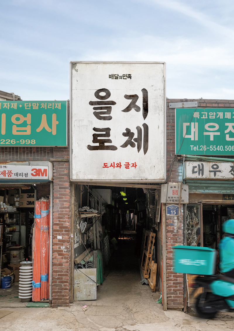
Kim Bong-jin, the founder of Baemin’s holding company Woowa Brothers and a former designer, has long been interested in old Korean signage. He has thousands of photos of street signs stored on his smartphone, and his favorites are the Euljiro signs from the 1960s and 1970s. The calligraphy on these signs, commonly seen on Euljiro Tool Street, was written by several craftsmen known at the time as the “sign grandpas.” They would travel the neighborhood on bicycles laden with paint cans and create signs in their own unique handwriting on tin plates and wooden planks.
One of the signboards that Kim photographed was for an auto repair shop whose name consisted of seven syllables. “The rough design of the font was interesting, each stroke teeming with power. It had the charm of something incomplete,” Han Myeong-su recalls.
Eventually, Han discovered that an associate, Seok Geum-ho, had a photo of the same signboard stored on his phone. Seok happens to be the chairperson of Sandoll, a longtime partner of Woowa Brothers specializing in fonts. “Mr. Seok had also taken a picture of the sign because he liked the lettering. It was a moment that confirmed the shared vision of Seok and Kim, two creators fascinated by the era. The sign came to serve as the prototype of the Euljiro font,” Han explains.
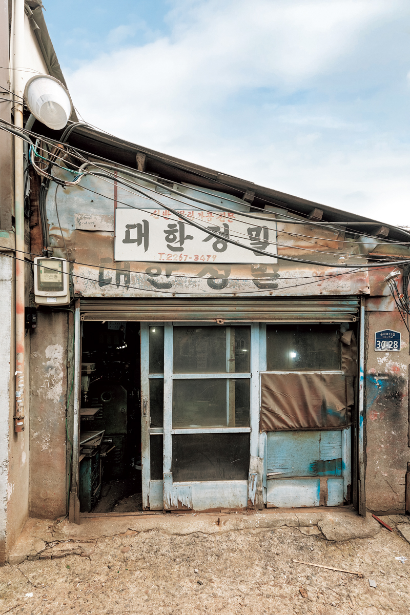
Many of Euljiro’s calligraphy signboards from the 1960s and 1970s still remain. Baemin’s Euljiro font series is inspired by their brushwork.
© Woowa Brothers
CHARMING BRUSHSTROKES
The sign’s original seven syllables, created half a century ago, led to 200 more, forming the foundation of the new font. When the total number reached 2,350, Baemin had the minimum needed for the Euljiro style to be officially recognized as an independent Hangeul font.
“Sandoll specializes in corporate fonts, so they tend to create refined ones. We asked the people there to ‘roughen up’ the letters a little,” Han recalls.
“For instance, Sandoll draws circles very neatly, and the eighth consonant of Hangeul is a complete circle. But when you use a brush, you have to draw it in two parts, one half circle on the left and the other on the right. This results in a ragged circumference with the top bulging out a bit. We asked them to preserve the irregular charm of brushstrokes, and they were all excited to work on something new.”
The Euljiro font soon became popular for its practicality and unique calligraphy style. It appeared in a myriad of settings, from subtitles for TV variety shows to banners at political demonstrations. “Whenever our team members noticed the font had been used, they shared images of it in our chat room. We could see that it was making a strong impression on the public, which, in turn, gradually solidified Baemin’s brand image.”
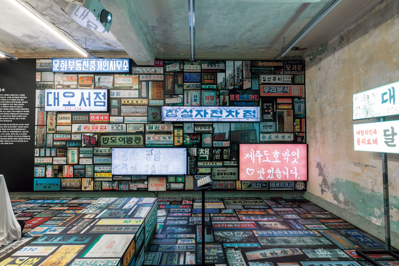
Signs collected from across the country. Many of Baemin’s fonts, including Hanna, its first, were inspired by old signs.
© Woowa Brothers
FURTHER FONTS
The Euljiro font also attracted retro culture enthusiasts. When Baemin realized it had a style statement on its hands, the company saw an opportunity to not only promote the font but also raise awareness of the ongoing redevelopment that was slowly robbing Euljiro of its character. Baemin collaborated with internationally acclaimed photographer MJ Kim, who spent six months exploring the area, recording the narratives of locals of all ages and professions, from seasoned blacksmiths to budding artists.
In 2020, his photos of the faces of Euljiro were displayed at the Sejong Center in Seoul in an exhibition titled Hey, Mr. Jumul. What, Mr. Mokhyeong? in reference to the cast iron and wooden molds used by Euljiro’s craftsmen and artists. What began with the visual attraction of old signs had grown into an interest in the neighborhood and its people. In preparing for the exhibition, Baemin also came up with the idea for its next font.
“The weathered signs, whose paint had peeled off over the years, looked quite stylish. It inspired us to develop another Euljiro font, reflecting that worn-out look, and people’s reaction to it was quite positive,” Han says. “We went as far as releasing a version where the letters had essentially faded away. We continued to refine the new styles, contemplating ways to make the wear appear more natural.”
The former of these two fonts, named “Baemin Euljiro Ten Years Later,” was unveiled in 2020. It replicated the look of a ten-year-old sign, its letters weathered by exposure to the elements. The latter, named “Baemin Euljiro OraeOrae” and released the following year, is so faint that the letters are hardly visible. (“Orae orae” means “for a long, long time.”)
During the three years in which the Euljiro font series was introduced, Baemin evolved into a company with a distinct identity. Though it didn’t directly impact the company’s performance, the cultural influence of the Euljiro fonts on everyday life exceeded expectations. “Creators aspire for widespread acceptance of their work. Witnessing projects to which I’ve contributed being incorporated into culture and embraced by people has been really enjoyable and makes me happy,” says Han.
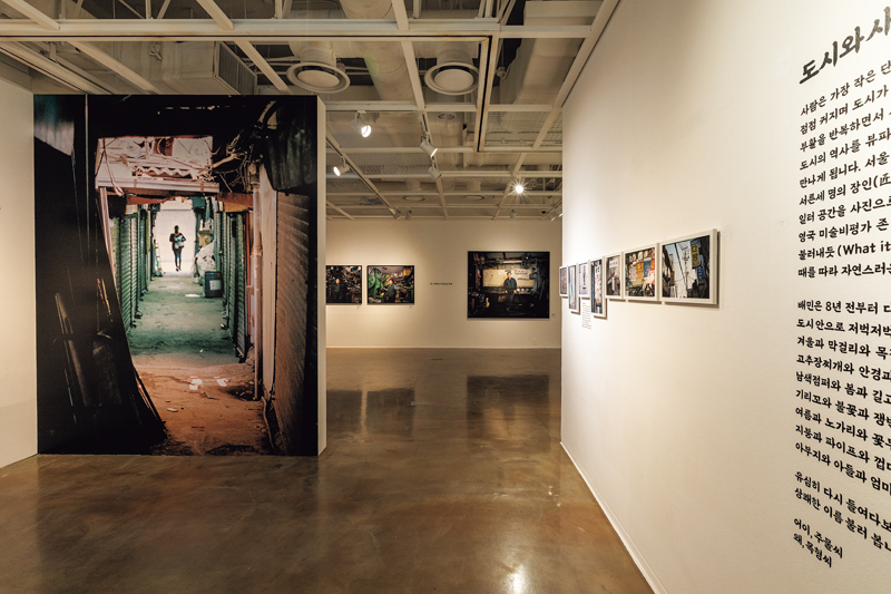
Baemin’s font project began with a curiosity about old signs. The Euljiro font became the catalyst for collaborating with photographer MJ Kim who took Polaroids of Euljiro’s industrial artisans. They were displayed at the Hey, Mr. Jumul. What,Mr. Mokhyeong? exhibition at the Sejong Center in 2020.
© Woowa Brothers